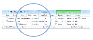
The bullet graph has recently been updated, here are some of the new features:
- Tested and working in Excel 2013.
- Featured measure color now customizable via the ribbon.
- All sections of the qualitative range now color customizable via the ribbon.
- Reverse function on the qualitative range now reverses the order of the range sections, instead of the color of each section.
- Qualitative range can now easily have sections differentiated by the intensity of a single color.
Watch "How to use the Aculocity Bulletgraph" on Vimeo
Easy Integration And Use
Integrated directly into the Office ribbon for easy use inside Excel. Ease of use - even connecting different sheets to create your Bullet Graph.
Avoids Common Graph Issues
Replacement graph to combat the fundamental issues with dashboards and gauges (Display too little information, require too much space and cluttered with useless decoration).
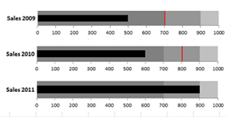
Visual Data Comparison
Use multiple graphs on the same sheet to represent comparable data.

Fully Customizable
Change the look and feel of the graph to suit your needs. Orientate the graph to fit your solution.
Accessible
Measures are displayed as varying intensities of the same hue thus making them easy to read for those who are colour-blind.
Easy To Read
With a single primary measure (quantitative scale) which is compared to a qualitative scale to represent data in a very powerful yet simple way.
The Aculocity Bullet Graph has been to work in Microsoft Excel 2007, 2010, and 2013. If you would like to leave any feedback regarding our Bullet graph please send us a note here.